
Customer Onboarding for a New App: Design the First Useful Action
In short
Design customer onboarding for a new app around the first useful action: the first thing a new user can do that they would describe as getting something done. Put nothing in front of it that could come later. Ask only for what that task needs, help people where they stall, make every step usable with a keyboard, screen reader or password manager, record each step as an event, and ask for feedback once the outcome is reached.
Key takeaways
- Name the first useful action in the user's words, as something they could say they did, such as "I booked my first appointment". Design the journey backwards from that sentence.
- Every step before the first useful action has to earn its position. Profile details, invitations, preferences and permission prompts can usually wait until the moment they are needed.
- A guided first task beats a product tour. A tour explains the buttons; a first task has the user press them on something that matters to them.
- Onboarding is where accessibility tends to break first: verification codes that expire, puzzles, blocked pasting and slides that advance on their own.
- Record each onboarding step as a named event, so you can see which step people abandon, and ask for feedback right after the useful outcome. ---
Table of contents
A new app usually greets its first customers with a welcome screen, three slides about features, a form asking for a name, a company and a phone number, then a request to allow notifications. By the time the app is ready to be used, the person has given a lot and received nothing.
Onboarding should help users achieve something. Not learn the layout, not fill in a profile: achieve one thing they came for. Everything in the first-use journey can be designed around that idea, from the sign-up form to the moment you ask what they thought.
If your app is already live, our guide to the first three months after an MVP goes live sets out where onboarding sits among everything else competing for attention. This post goes one level down, into designing the journey itself.
What customer onboarding for a new app should achieve
Customer onboarding for a new app has one job: to get a new user from opening the app to a result they value, with as little in between as possible. Teaching the interface, collecting data and introducing features are all secondary, and most of them can happen later.
That result is the activation point. For a booking app it might be a first appointment confirmed; for an invoicing tool, a first invoice sent; for a field service app, a first job closed with a photo attached. A new user who reaches it has a reason to come back. One who does not has only an account.
Name the first useful action before designing screens
Write the first useful action as a sentence the user could say afterwards, in their words rather than yours. "I sent my first quote" is useful. "The user completed the quote creation flow" is a description of a screen, and it hides whether anything good happened.
That sentence becomes the test for every screen in the journey. Does this step help the user reach the action, or does it only help us? Steps that help us, such as marketing preferences or a referral prompt, may still be worth having, but they belong after the action, not before it.
Business apps often need more than one first useful action
In a business app, the person who signs up is often not the person who will use it every day. The buyer wants to see that it will work for the team. The admin needs to set up accounts and settings. The daily user needs to do their actual job in it.
Each of them needs their own first useful action, and treating them as one journey usually means the admin's setup screens land on the daily user. Name all three, then decide which one the first session is designed for and how the others are invited in.
Sign-up should ask only what the first task needs
Go through the sign-up form field by field and ask what breaks if the field is removed. If the first task can be done without it, it can be asked for later, at the point where it is needed and where the reason is obvious to the user.
The same applies to permissions. A request for location, contacts or notifications at the door gets refused because the user cannot yet see why the app wants it. Asked at the moment it is used, with a line explaining what it is for, the same request makes sense.
Where the product allows, let people try before they register. A user who has already made something in the app has a reason to create an account to keep it. The trade-off is real: a shorter sign-up gives sales and marketing less to work with on day one, and someone has to agree that the missing details will be gathered later, in the product.
The first task: guided work, not a product tour
The first task should be real work, done with light guidance. A product tour describes the buttons; a first task has the user press them on something that matters to them. People skip tours, and the ones who sit through them rarely remember what they were shown.
There are two good ways to start. One is to begin with the user's own material: import their contacts, connect their calendar, upload the file they already have. The other is a worked example they can change, so the first screen shows what a finished result looks like instead of an empty page asking to be filled.
Either way, make mistakes cheap. An undo, a draft that saves itself, or a test mode that does not send anything to real customers lets a new user try the app without worrying about breaking something on their first visit.
Support placed where new users get stuck
Support in onboarding works best inside the flow, next to the step where people hesitate, rather than behind a help link in a menu. A short line of explanation beside a confusing field does more than a full help centre nobody opens.
Give people a way to reach a person from inside the journey too, and say how quickly they will hear back. Then log where support requests come from. If most questions arrive from the same step, that step is the problem, and rewording the help text is a patch rather than a fix.
For apps where setup is genuinely complex, such as connecting to other business systems, a short assisted setup call can be part of onboarding by design. That is a decision about the product, not a sign that the flow has failed.
Accessible onboarding: where first-use flows usually fail
Onboarding is often the least accessible part of an app, because it is built early, tested by people who already know the product, and full of patterns that shut people out. A user who cannot get past sign-up never sees the rest of the app, however well the rest was built.
The usual failures are specific:
- Authentication that relies on memory or puzzles. The W3C's Accessible Authentication criterion (WCAG 2.2, level AA) gives password managers and copy and paste as ways to meet it. Blocking paste into a code or password field works against both.
- Verification codes that expire quickly. Someone using a screen reader or switching between apps to fetch a code needs time, and a route to request a fresh code without starting again.
- Slides that advance on their own. WCAG's Pause, Stop, Hide criterion requires a way to pause moving content that starts automatically, lasts more than five seconds and sits alongside other content.
- Asking for the same details twice. The Redundant Entry criterion expects information already given in a process to be filled in or offered for selection, not typed again.
- Coach marks and overlays. Pop-up hints that trap keyboard focus, cannot be dismissed without a mouse, or are read in the wrong order by a screen reader.
Test the onboarding flow with a keyboard only, with a screen reader, with text enlarged and with a password manager doing the typing. It takes an afternoon, and it catches most of the list above.
Onboarding analytics: one event for every step
Onboarding analytics should record each step of the first-use journey as a named event, from the first screen to the first useful action. With one event per step, you can see which step people abandon, rather than only knowing that some of them never came back.
Agree the event list during design, before anything is built. A typical set: sign-up started, sign-up completed, first task started, help opened (with the step it was opened from), first useful action completed, and second visit. Record the time between steps too: a step that everyone completes but that takes ten minutes is worth knowing about.
Collect only what you will use, ask for consent where it is required, and keep personal details out of event names and properties. An event that says a step was completed is enough; it does not need to carry what the user typed.
Ask for feedback right after the useful outcome
The best moment to ask a new user for feedback is straight after they reach the first useful action. They have just been through the whole journey and still remember where it was awkward. Asking at sign-up gets you guesses, and asking a month later gets you a vague impression.
Keep it to one question, and make it specific: "What nearly stopped you getting here?" names a problem the team can fix in a way that a score out of ten does not. Optional, one tap to dismiss, never blocking the result they just earned.
People who leave before the outcome are harder to hear from, and often more useful. A short question when someone abandons setup, or a plain email a day later asking what got in the way, reaches the users the funnel shows you only as a drop.
An illustrative onboarding journey for a new app
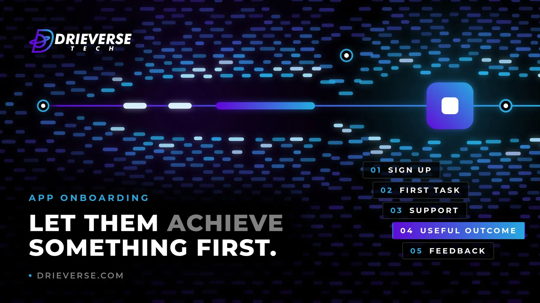
This example is invented for illustration and comes from no client work. It follows the five stages for a hypothetical appointment booking app for small clinics.
| Stage | What the user does | What the team designs | Event recorded |
|---|---|---|---|
| Sign up | Enters an email and a clinic name | Two fields, paste allowed, no phone number yet | Sign-up completed |
| First task | Adds one practitioner and one opening slot | A worked example to edit, no empty calendar | First task started |
| Support | Pauses on setting slot length | One line of help beside the field, and a chat link | Help opened, with the step |
| Useful outcome | Sends a test booking link and books it | A test mode that sends nothing to real patients | First booking confirmed |
| Feedback | Answers one optional question | "What nearly stopped you getting here?" | Feedback given or dismissed |
Everything else the clinic needs, from staff accounts to reminders and payment settings, is asked for after the first booking, when the app has already shown it works.
When onboarding is not the problem
Better onboarding cannot rescue a product people do not need. If new users reach the first useful action quickly and still do not return, the journey has done its job, and the question has moved to the value of the product itself.
The event data separates the two cases. Users who drop before the action point to onboarding; users who reach it and drift away point to the product. Knowing which one you are facing saves a team from redesigning sign-up for the third time when the real issue lies elsewhere.
If you are planning a new app, or the one you have launched loses people between sign-up and anything useful, discuss app or web development with us. Designing the first-use journey and the events behind it is part of how our app development and web development projects are scoped from the start.
Sources
- W3C: Understanding Success Criterion 3.3.8 Accessible Authentication (Minimum): WCAG 2.2 success criterion 3.3.8 (level AA) bars cognitive function tests in authentication unless an alternative or mechanism is offered; the W3C guidance names password managers and copy and paste as ways to meet it.
- W3C: Understanding Success Criterion 2.2.2 Pause, Stop, Hide: WCAG success criterion 2.2.2 (level A) requires a way to pause, stop or hide moving content that starts automatically, lasts more than five seconds and is presented alongside other content.
- W3C: Understanding Success Criterion 3.3.7 Redundant Entry: WCAG 2.2 success criterion 3.3.7 (level A) expects information already entered in a process to be auto-populated or available to select rather than typed again.
Frequently asked questions
Customer onboarding in an app is the journey from a new user opening it to reaching a first result they value, such as a first booking made or a first invoice sent. It covers sign-up, the first task, help along the way, and the first request for feedback. Good onboarding is judged by how many new users reach that result, not by how much of the interface they have seen.
Usually a guided first task works better than a product tour. A tour explains where the buttons are, and people tend to skip it or forget it. A first task has the user do real work, with short hints at the points where they might hesitate, so they learn the app by producing something useful in it.
There is no right number. Count the steps between opening the app and the first useful action, and ask of each one whether the user could reach that action without it. Anything that can come later, such as profile details, invitations or notification permissions, should be moved to the point where it is actually needed.
Check the sign-up and first-use screens against WCAG 2.2. In practice that means allowing password managers and paste in login and code fields, giving time to enter verification codes, letting people pause anything that moves on its own, not asking for the same details twice, and making hints and overlays usable with a keyboard and a screen reader.
Record each step of the first-use journey as a named event: sign-up started and completed, first task started, help opened and from which step, first useful action completed, and a second visit. Track the time between steps as well. This shows exactly where new users stop, instead of only showing that some of them never returned.
Ask straight after a new user reaches the first useful action, while the journey is fresh in their memory. Keep it to one optional question, ideally specific, such as what nearly stopped them getting there. For users who leave before that point, a short question when they abandon setup or a plain email afterwards reaches people the data alone cannot explain.
Have a App development project like this in mind?
Tell us what you are trying to build. We will tell you plainly what App development work like this would take.
Get a quoteContact Us
Lahore, Pakistan · London, U.K · Austin TX, U.S · Toronto, Canada